

|
Name: Tyrone Simpson
|
Student Number:
|
|
ISM 4011: Introduction to
Information Systems
|
|
|
Graphics and Visual
Communication for Managers (GVCM)
|
|
|
Chapter 4: Using Photos &
Illustrations and
Chapter 5: Integrating
Graphics & Text
|
|
|
DIRECTIONS: Read the chapter first,
then:
1. Answer the questions as indicated below in the space under the
question. Answers may be found in the
appropriate chapter of your GVCM textbook.
2. Change your answers to blue
so they can be easily distinguished from the questions.
3. Create a new blog post and copy this information into the post.
4. Once it is pasted into your blog, select all the text (CTRL A) and change the font to TREBUCHET.
5. Change the TITLE of the post to GVCM Chapter 4 & 5: Photos, Illustrations, and Text Integration
|
|
|
Chapter 4: Using Photos
and Illustrations
|
|
|
1. How can photos and illustrations enhance a document or
presentation? Does a graphic always add value to the document? Why is it
important to choose the images carefully?
|
|
|
Photos and illustrations enhance a
document or presentation by bring greater understanding to the viewer,
illicit a quicker and deeper emotional response, and convey meanings and
suggestions faster than words. Never-the-less, using the wrong graphic can
detract from the intended message and diminish the quality of the document.
|
|
|
2. What should you consider when deciding to use a color image or a black and white image?
|
|
|
Before deciding to use a color image or
black and white image you must consider whether or not the image or some
aspect of the image will overpower or dominate other information in the
document.
|
|
|
3. Describe
the following photographic terms:
|
|
|
1. Scale- how big or small does the photo
need to be to convey its message appropriately and accurately?
2. Cropping- how is the subject matter of
the photograph included within the frame of the image?
3. Focus- is the subject matter clear
enough for the viewer to access the information?
4. Tonal range-do the values of the image
allow for appropriate visual legibility?
|
|
|
4. What are stock photos? How can you find them? Are
you permitted to use any photos you find on the Internet free? Are free photos available to you (try
searching the Internet for FREE STOCK PHOTOS)?
|
|
|
Stock photos are pre-captured or standard
images. These images can easily be found on the internet. Not all stock
images are free and it may be necessary to pay for some stock photos. There
are several websites that offer stock photos 100% free.
|
|
|
5. iStockPhoto: IStockPhoto is one of
thousands of providers of stock photography. To answer these questions, go to
the company website at: http://www.istockphoto.com/
|
|
|
1. Besides photos, what other stock materials can you find at
iStockPhoto?
In addition to stock photos iStockPhoto
offers free stock video clips, free illustrations, and free audio clips.
2. Describe the methods of payment for images (scroll down to the
bottom of the page):
Customers are able to purchase files by
paying were credits that are deducted each time a download of a file is
completed. Corporate customers can setup a payment plan in which they are
billed every 30 days and their credits are deducted.
3. Can you get free photos from iStock? If so, how?
Individuals can received receive free
stock photos by becoming a member of iStock and registering online.
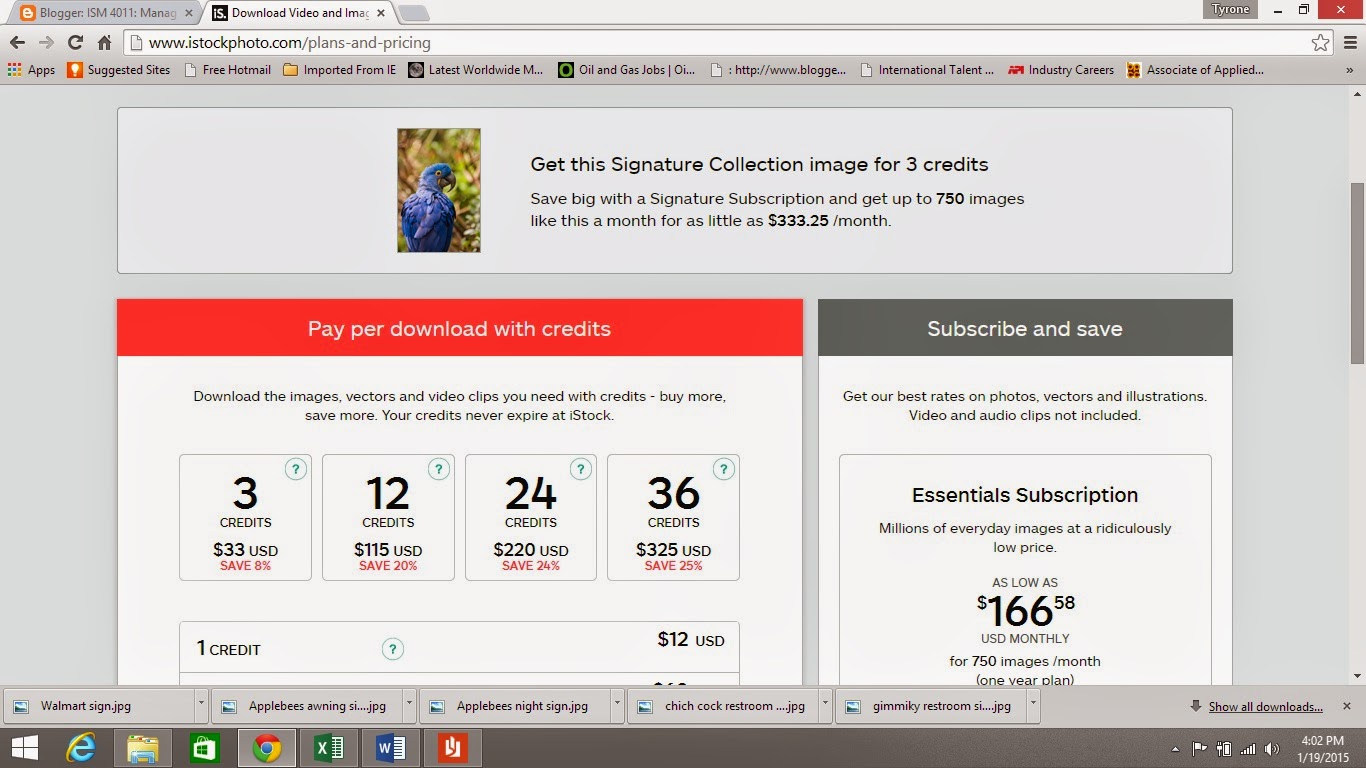
4. Think of an exotic animal
to search for in the iStockPhoto gallery and then:
a. In the iStockPhoto SEARCH
box, search for an image of the animal.
b. When you find a dramatic
image of the animal, click on it to get to the photo’s pricing page.
c. Now click on the
PAY-AS-YOU go link to see the pricing for the image.
d. Take a SCREENSHOT of the
pricing page of the image, paste into PAINT, and save in your GRAPHICS
folder.
e. When this document has
been copied into a new blog post, insert the image in the space below. (See
CHAPTER 3 for how to save screenshots.)
|
|
|
My exotic animal image:
 |
|
|
6. Describe when an illustration may be more effective
than using a photograph in a
document:
|
|
|
Illustrations may be extremely effective
when attempting to convey abstract ideas or when attempting to conceptualize hypothetical
constructs.
|
|
|
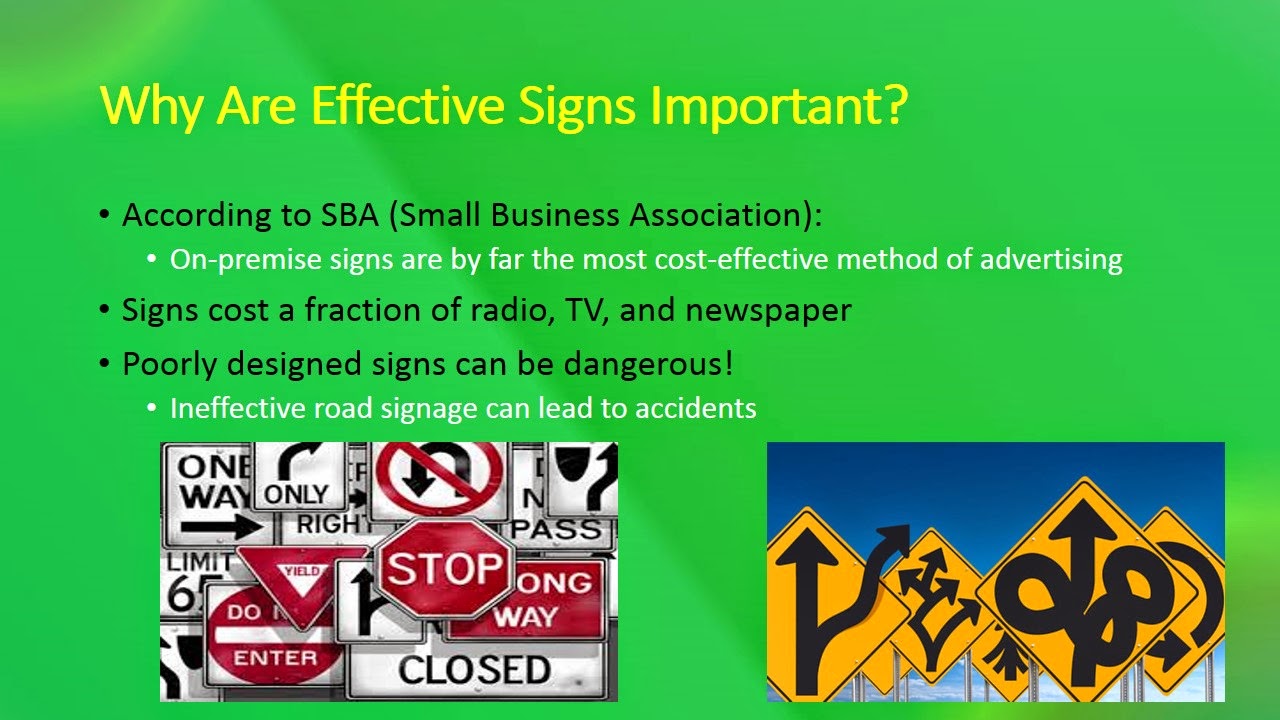
7. What are some of the disadvantages of using photos in a document?
|
|
|
Some disadvantages of using photos in a
document is that the photo may become aged, out of style, and the images obsolete.
Also, photos may overshadow the purpose of the document or provide too much
background information which would obscure the intended message.
|
|
|
8. Describe the following issues regarding image preparation:
|
|
|
1. Color format-relates to the RGB (Red, Green,
Blue) color system or the CMYK (Cyan, Magenta, Yellow, and Black) color
system.
2. Resolution- refers the dpi (dots per
inch) of an image
3. Cropping- refers to the elimination of
any unnecessary digital information within an image.
|
|
|
9. Describe five best
practices for using images in documents and presentations:
|
|
|
|
|
Chapter 5: Integrating
Graphics and Text
|
|
|
1. Briefly explain these three roles that visuals play in text:
|
|
|
1. Visuals that evoke feelings- need no
contextual explanation; created to solicit a certain emotion
2. Visuals that supplement
text- indicative of graphic data; used to pictorially
enforce the text
3. Visuals that complement the
text- typical
of instructional manuals; images work with the text to help communicate the
main idea
|
|
|
2. Describe five best
practices for integrating text and graphics:
|
|
|
|
|
Name: Tyrone Simpson
|
Student Number:
|
|
ISM 4011: Introduction to
Information Systems
|
|
|
Graphics and Visual
Communication for Managers (GVCM)
|
|
|
Chapter 3: Using Color
|
|
|
DIRECTIONS: Read the chapter first,
then:
1. Answer the questions as indicated below in the space under the
question. Answers may be found in the
appropriate chapter of your GVCM textbook.
2. Change your answers to blue
so they can be easily distinguished from the questions.
3. Create a new blog post and copy this information into the post.
4. Once it is pasted into your blog, select all the text (CTRL A) and change the font to TREBUCHET.
5. Change the TITLE of the post to: GVCM Chapter 3: Using Color
|
|
|
1. Define the following properties of color:
|
|
|
|
|
2. Describe the traits (both positive and negative) often associated
with three of the colors described
in this chapter:
|
|
|
|
|
3. What is the significance of cultural context with regard to
color?
|
|
|
Colors can have varying meanings within different cultures.
|
|
|
4. What is the significance of
physical context with regard to
color?
|
|
|
Colors are never isolated and when making color selections you must
consider the color in relation to other colors.
|
|
|
5. What are some design concepts to keep in mind when choosing
gray-scale or choosing color?
|
|
|
When choosing gray-scale make the value of the grays at least 20% different
from each other. When choosing color make sure that the colors will be
distinguishable in either print media or video media.
|
|
|
6. List five methods to use color strategically:
|
|
|
|
|
7. Briefly describe the following types of color systems:
|
|
|
|
|
8. Why is it recommended that you be consistent and conservative when choosing a color palette for a
business or a project?
|
|
|
Utilizing a simple and consistent color palette will reduce visual
clutter and help guide the viewer through the document or presentation in a
clear and even manner.
|
|
|
9. List and briefly describe five things to consider when choosing a
color palette:
|
|
|
|
|
10. On page 43, the textbook authors assert that with regard to
visual communication, color has
power. After reading this chapter, in what ways can you utilize this
power in your business communications?
|
|
|
|
|
11. What could you do if you must choose a color palette for a
business or project but have no experience or talent for picking appropriate
colors?
|
|
|
|
|
12. Traumwind Color Match:
Conduct a Google search for the term TRAUMWIND
COLOR MATCH. Go to the TRAUMWIND site. What is the purpose of this site?
Note: On page
54, the book lists other sites which can help you select a color palette.
|
|
|
|
|
|
13. Try out TRAUMWIND:
a. Enter
this value in the Traumwind color number box:
#B3F2FF (do you see the 6-color palette that is
created?)
b. Now
enter a different 6-digit number into the box (Traumwind may change the
number to a “web safe” color number that is close to the number you select).
Experiment entering numbers until you find a color palette that you find
attractive.
c. Screenshot:
1. Once you create a Traumwind color palette that you like, press the
PRINT SCREEN button on your
keyboard to copy the Traumwind screen onto the Clipboard.
3. Open MS PAINT and paste the screenshot image into PAINT (CTRL-V).
4. Save the image with an appropriate name into your GRAPHICS
folder.
5. Once you copy this document into your blog, insert the image of your
screenshot into the space below.
|
|
|
My
Traumwind Color Palette:
 |
|
|
14. Design Seeds: Go to
the following web site: http://design-seeds.com/
Design Seeds is another web site for you, the graphic designer to
help you find color schemes for your work (web sites, documents, images,
logos, etc.). Click on the PALETTE SEARCH and then click on a THEME from the
list of themes. Scroll through the palettes until you find one that you like
(if you don’t like any of them, try a different theme). Take a screenshot of
the palette and paste it here:
|
|
|
Theme (what theme does
your palette come from?): Flora Palet
My
Design Seeds Color Palette:
 |
|
|
Roll your cursor over the color chips on the right side of the color
scheme (under the SEE SIMILAR COLORS). What does the “tool tip” that pops up indicate?
Why is this useful to designers? Try clicking on a color chip. What does it
do for you?
|
|
|
The tool tip indicates the hexadecimal number. This is helpful for designers by allowing them to select or create appropriate palette colors when using websites like Traumwind.
When clicking the color chip the sight automatically retrieves other color palettes and themes similar to the specific hexadecimal number.
|
|
|
Name:
|
Student Number:
|
|
ISM 4011: Introduction to
Information Systems
|
|
|
Graphics and Visual
Communication for Managers (GVCM)
|
|
|
Chapter 2: Creating Tables
and Graphs
|
|
|
DIRECTIONS: Read the chapter first, then:
1. Answer the questions as indicated below in the space under the
question. Answers may be found in the
appropriate chapter of your GVCM textbook.
2. Change your answers to blue
so they can be easily distinguished from the questions.
3. Create a new blog post and copy this information into the post.
4. Once it is pasted into your blog, select all the text (CTRL A) and change the font to TREBUCHET.
5. Change the TITLE of the post to: GVCM: Chapter 2: Creating Tables and Graphs
|
|
|
1. How can tables and graphs be useful to readers?
Note: Excel uses the term chart for graph.
|
|
|
Tables and graphs can be useful to readers by allowing the reader to process
information faster and more efficiently than if expressed by words alone.
|
|
|
2. List four criteria for successful graphics:
|
|
|
|
|
3. Briefly explain this principle of graphic
design: Design for a purpose
|
|
|
The principle of "Design for a purpose" in graphic design addresses the
questions of:
|
|
|
4. Briefly explain this
principle of graphic design: Be
explicit
|
|
|
The graph or table should be able to be understood quickly and the
information should be coherent and to the point.
|
|
|
5. Briefly explain this principle of graphic design: Maximize data ink; minimize non-data ink
|
|
|
This principle expresses the concept that all non-essential
information and design features should be eliminated and the most pertinent
information should be included so that the graph is easier to read.
|
|
|
6. Briefly explain this principle of graphic design: Ensure integrity
|
|
|
This principle of ensuring integrity states that the information in
the graph must not only be true but presented in a way that eliminates the
possibility of being distorted.
|
|
|
7. Define the following table terms:
|
|
|
|
|
8. Describe the purpose of each of these types of tables:
|
|
|
|
|
9. List at least five best
practices in designing tables:
|
|
|
|
|
10. Define the following graph types:
|
|
|
|
|
11. List at least five best practices in designing graphs:
|
|
|
|
PixlrFree online photo editing programSimple to use and a lot of Fun!.jpg) |
| Before Pixlr |
.jpg) |
| After Pixlr |
.jpg) |
| Before Pixlr |
.jpg) |
| After Pixlr |
 |
| Creative Inspiration |
 |
| Shadows Within |
 |
| Masquerade |
 |
| Before Pixlr |
 |
| After Pixlr |